Excess rentals in TfL bike sharing
url <- "https://data.london.gov.uk/download/number-bicycle-hires/ac29363e-e0cb-47cc-a97a-e216d900a6b0/tfl-daily-cycle-hires.xlsx"

# Download TFL data to temporary file
httr::GET(url, write_disk(bike.temp <- tempfile(fileext = ".xlsx")))
## Response [https://airdrive-secure.s3-eu-west-1.amazonaws.com/london/dataset/number-bicycle-hires/2022-09-06T12%3A41%3A48/tfl-daily-cycle-hires.xlsx?X-Amz-Algorithm=AWS4-HMAC-SHA256&X-Amz-Credential=AKIAJJDIMAIVZJDICKHA%2F20220919%2Feu-west-1%2Fs3%2Faws4_request&X-Amz-Date=20220919T132703Z&X-Amz-Expires=300&X-Amz-Signature=94560235fddb8abec5c25ae5cdd2b43e63fab1f8b962621790db52ef86c16da8&X-Amz-SignedHeaders=host]
## Date: 2022-09-19 13:27
## Status: 200
## Content-Type: application/vnd.openxmlformats-officedocument.spreadsheetml.sheet
## Size: 180 kB
## <ON DISK> C:\Users\GABRIE~1\AppData\Local\Temp\Rtmp4KXTLW\file601c11951c51.xlsx# Use read_excel to read it as dataframe
bike0 <- read_excel(bike.temp,
sheet = "Data",
range = cell_cols("A:B"))
# change dates to get year, month, and week
bike <- bike0 %>%
clean_names() %>%
rename (bikes_hired = number_of_bicycle_hires) %>%
mutate (year = year(day),
month = lubridate::month(day, label = TRUE),
week = isoweek(day))The first one looks at percentage changes from the expected level of monthly rentals.
bike_monthly_avg<-bike%>%
  filter(year %in% c(2017, 2018, 2019, 2020, 2021, 2022))%>%
  group_by(year, month)%>%
  summarise(monthly_avg=mean(bikes_hired))%>%
  ungroup()%>%
  add_row(year=2022, month="Sep")%>%
  add_row(year=2022, month="Oct")%>%
  add_row(year=2022, month="Nov")%>%
  add_row(year=2022, month="Dec")%>%
  group_by(year, month)%>%
  mutate(date=as.Date(paste("01", month, toString(year), sep="/"), "%d/%b/%Y"))

bike_monthly_avg_across_years<-bike%>%
  filter(year %in% c(2016, 2017, 2018, 2019))%>%
  group_by(month)%>%
  summarise(monthly_avg_across_years=mean(bikes_hired))

bike_monthly_avg <-bike_monthly_avg%>%
  inner_join(bike_monthly_avg_across_years, by = "month")%>%
  mutate(monthly_avg_across_years=ifelse(year==2022 & (month %in% c("Sep", "Oct", "Nov", "Dec")), NA, monthly_avg_across_years))

bike_monthly_avg
## # A tibble: 72 × 5
## # Groups: year, month [72]
## year month monthly_avg date monthly_avg_across_years
## <dbl> <chr> <dbl> <date> <dbl>
## 1 2017 Jan 20596. 2017-01-01 20617.
## 2 2017 Feb 22091. 2017-02-01 22049.
## 3 2017 Mar 26444. 2017-03-01 23237.
## 4 2017 Apr 30591. 2017-04-01 28299.
## 5 2017 May 32019. 2017-05-01 33270.
## 6 2017 Jun 36610. 2017-06-01 35413.
## 7 2017 Jul 36511. 2017-07-01 38109.
## 8 2017 Aug 32071. 2017-08-01 34393.
## 9 2017 Sep 31158. 2017-09-01 33013.
## 10 2017 Oct 31409. 2017-10-01 30235.
## # … with 62 more rowslibrary(ggbraid)
ggplot(bike_monthly_avg,aes(x=date))+geom_line(aes(y=monthly_avg))+geom_line(aes(y=monthly_avg_across_years), color="blue", size=1)+facet_wrap(~year, scales="free_x", nrow=2) + scale_x_date(date_breaks = "1 month", date_labels = "%b")+
geom_braid(aes(ymin=monthly_avg, ymax=monthly_avg_across_years, fill=monthly_avg>monthly_avg_across_years))+theme(legend.position="none")+
labs(title = "Monthly changes in TfL bike rentals",
subtitle = "Change from monthly average shown in blue and calculated between 2016-2019",
caption = "Source: TfL, London Data Store",y="Bike rentals", x = element_blank())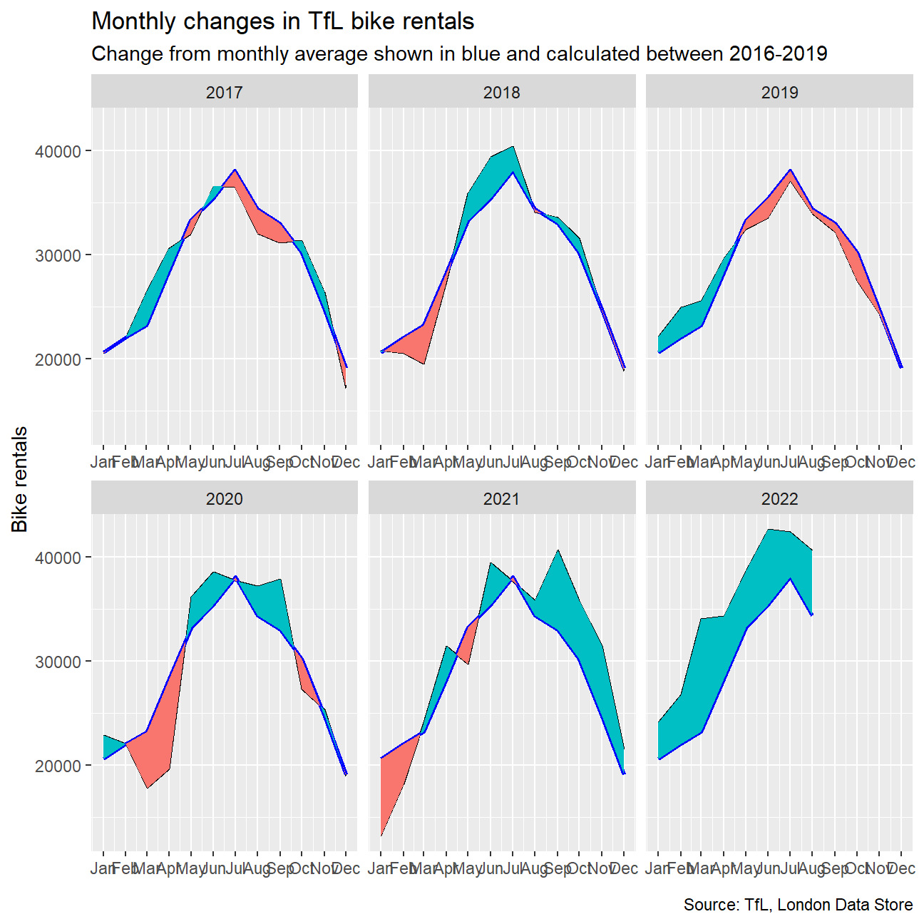
This graph looks at percentage changes from the expected level of weekly rentals. The two grey shaded rectangles correspond to Q2 (weeks 14-26) and Q4 (weeks 40-52).
bike_weekly_avg<-bike%>%
  mutate(year_corrected=ifelse(month=="Jan"&(week==52|week==53), year-1, ifelse(month=="Dec"&(week==1), year+1, year)))%>%
  filter(year_corrected %in% c(2017, 2018, 2019, 2020, 2021, 2022))%>%
  group_by(year_corrected, week)%>%
  summarise(weekly_avg=mean(bikes_hired))%>%
  ungroup()

bike_weekly_avg_across_years<-bike%>%
  mutate(year_corrected=ifelse(month=="Jan"&(week==52|week==53), year-1, ifelse(month=="Dec"&(week==1), year+1, year)))%>%
  filter(year %in% c(2016, 2017, 2018, 2019))%>%
  group_by(week)%>%
  summarise(weekly_avg_across_years=mean(bikes_hired))%>%
  ungroup()

bike_weekly_avg <- bike_weekly_avg %>%
  inner_join(bike_weekly_avg_across_years, by = "week")%>%
mutate(weekly_change=weekly_avg/weekly_avg_across_years-1)

bike_weekly_avg
## # A tibble: 296 × 5
## year_corrected week weekly_avg weekly_avg_across_years weekly_change
## <dbl> <dbl> <dbl> <dbl> <dbl>
## 1 2017 1 17662. 17202. 0.0267
## 2 2017 2 21858. 22056. -0.00899
## 3 2017 3 22691. 21892. 0.0365
## 4 2017 4 21269. 21470. -0.00933
## 5 2017 5 21643. 21194. 0.0212
## 6 2017 6 19782. 20226. -0.0219
## 7 2017 7 24019. 23254. 0.0329
## 8 2017 8 23326. 23575. -0.0106
## 9 2017 9 21642. 20167 0.0731
## 10 2017 10 26597. 23403. 0.136
## # … with 286 more rowsggplot(bike_weekly_avg, aes(x=week))+geom_line(aes(y=weekly_change))+facet_wrap(~year_corrected, nrow=2)+scale_y_continuous(labels = scales::percent)+scale_x_continuous(breaks=c(13, 26, 39, 53))+theme(legend.position="none")+
geom_braid(aes(ymin=0, ymax=weekly_change, fill=weekly_change>0))+
geom_rect(data=bike_weekly_avg, aes(xmin=13, xmax=26, ymin=-Inf, ymax=Inf), color="transparent", fill="grey20", alpha=0.005)+
geom_rect(data=bike_weekly_avg, aes(xmin=39, xmax=53, ymin=-Inf, ymax=Inf), color="transparent", fill="grey20", alpha=0.005)+geom_rug(mapping = aes(color = weekly_change>0), sides="b")+
labs(title = "Weekly change in TfL bike rentals",
subtitle = "% change from weekly averages calculated between 2016-2019",
caption = "Source: TfL, London Data Store",y=element_blank(), x = "Week")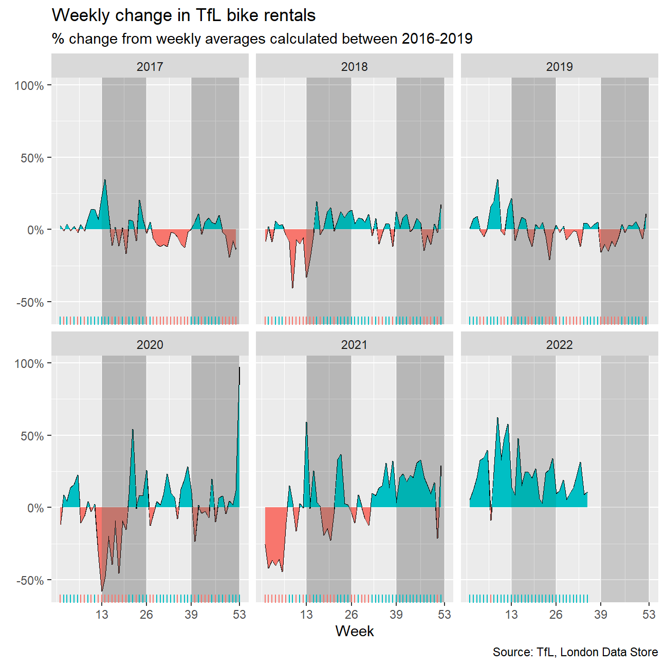
I use the mean to calculate expected rentals because according to the law of large numbers the sample mean approaches the expected value of a variable as the sample size grows infinitely large. This property makes the mean superior to median when it comes to calculating expected values.