Renewable Energy production across the World
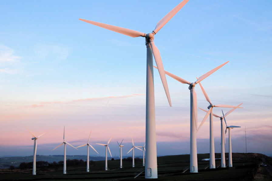
Share of renewable energy production in the world
The National Bureau of Economic Research (NBER) has a a very interesting dataset on the adoption of about 200 technologies in more than 150 countries since 1800. This is theCross-country Historical Adoption of Technology (CHAT) dataset.
The following is a description of the variables
| variable | class | description |
|---|---|---|
| variable | character | Variable name |
| label | character | Label for variable |
| iso3c | character | Country code |
| year | double | Year |
| group | character | Group (consumption/production) |
| category | character | Category |
| value | double | Value (related to label) |
technology <- readr::read_csv('https://raw.githubusercontent.com/rfordatascience/tidytuesday/master/data/2022/2022-07-19/technology.csv')

#get all technologies
labels <- technology %>%
  distinct(variable, label)

# Get country names using 'countrycode' package
technology <- technology %>%
  filter(iso3c != "XCD") %>%
  mutate(iso3c = recode(iso3c, "ROM" = "ROU"),
         country = countrycode(iso3c, origin = "iso3c", destination = "country.name"),
         country = case_when(
           iso3c == "ANT" ~ "Netherlands Antilles",
           iso3c == "CSK" ~ "Czechoslovakia",
           iso3c == "XKX" ~ "Kosovo",
           TRUE           ~ country))

#make smaller dataframe on energy
energy <- technology %>%
  filter(category == "Energy")

# download CO2 per capita from World Bank using {wbstats} package

co2_percap <- wb_data(country = "countries_only",
                      indicator = "EN.ATM.CO2E.PC",
                      start_date = 1970,
                      end_date = 2022,
                      return_wide=FALSE) %>%
  filter(!is.na(value)) %>%
  #drop unwanted variables
  select(-c(unit, obs_status, footnote, last_updated))

# get a list of countries and their characteristics
# we just want to get the region a country is in and its income level
countries <-  wb_cachelist$countries %>%
  select(iso3c,region,income_level)
I first produce a graph with the countries with the highest and lowest %
contribution of renewables in energy production. This is made up of
elec_hydro, elec_solar, elec_wind, and elec_renew_other.
renewables <- energy %>%
  filter(year == 2019, variable != "elec_cons") %>%
  select(-c(label, group, category, year)) %>%
  pivot_wider(names_from = variable, values_from = value)

highest_countries <- renewables %>%
  mutate(ren_energy_percentage = (elec_hydro + elec_solar + elec_wind + elec_renew_other) / elecprod) %>%
  slice_max(n = 20, order_by = ren_energy_percentage) %>%
  mutate(country = fct_reorder(country, ren_energy_percentage))

p1 <- ggplot(highest_countries, aes(x = ren_energy_percentage, y = factor(country))) +
         geom_bar(stat = "identity") + scale_x_continuous(labels = scales::percent) + labs(x = "Country", y = "% contribution of renewables in energy production")


lowest_countries <- renewables %>%
  mutate(total_ren_energy = (elec_hydro + elec_solar + elec_wind + elec_renew_other), ren_energy_percentage = round((total_ren_energy / elecprod), digits = 5)) %>%
  filter(ren_energy_percentage >= 0.0005) %>%
  slice_min(n = 20, order_by = ren_energy_percentage) %>%
  mutate(country = fct_reorder(country, ren_energy_percentage))

p2 <- ggplot(lowest_countries, aes(x = ren_energy_percentage, y = factor(country))) +
         geom_bar(stat = "identity") + scale_x_continuous(labels = scales::percent) +
  labs(x = "Country", y = "% contribution of renewables in energy production")

p1 + p2 + plot_annotation(title = "Highest and lowest % of renewables in energy production",
                          subtitle = "2019 data",
                          caption = "Source: NBER CHAT Database")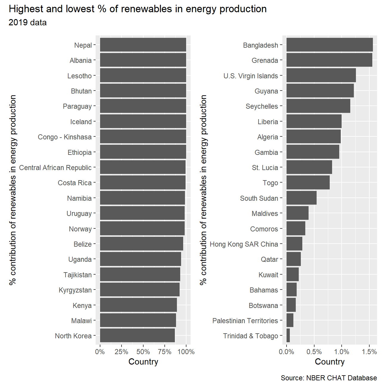
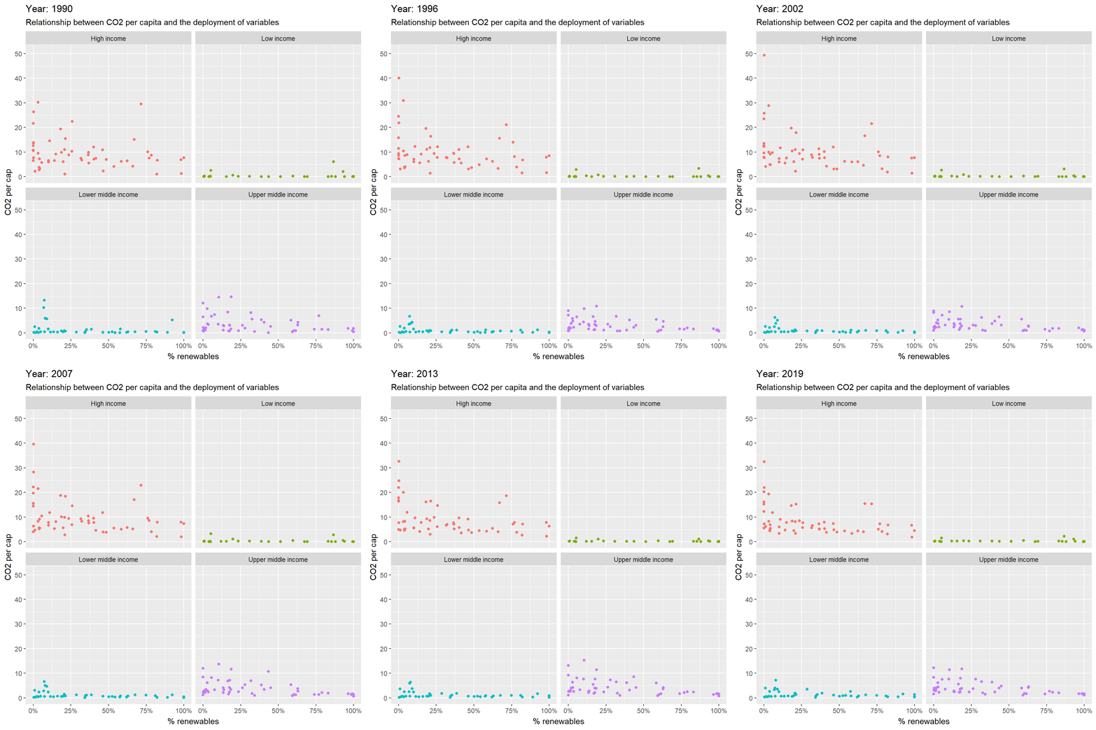
Second, I produce an animation to explore the relationship between CO2 per capita emissions and the deployment of renewables. As the % of energy generated by renewables goes up, do CO2 per capita emissions seem to go down? The answer is right here!
co2_renewable <- renewables %>%
  mutate(ren_energy_percentage = (elec_hydro + elec_solar + elec_wind + elec_renew_other) / elecprod) %>%
  inner_join(co2_percap, by = "iso3c") %>%
  inner_join(countries, by = "iso3c") %>%
  select(-c(country.y, elec_coal, elec_gas, elec_hydro, elec_nuc, elec_oil,
            elec_renew_other, elec_solar, elec_wind, elecprod, indicator_id, indicator,
            iso2c, region))

co2_renewable$date <- as.integer(co2_renewable$date)

ggplot(co2_renewable, aes(x = ren_energy_percentage, y = value, color = income_level)) +
  geom_point() +
  facet_wrap(~income_level) +
  scale_x_continuous(labels = scales::percent) +
  labs(title = 'Year: {frame_time}',
       subtitle = "Relationship between CO2 per capita and the deployment of variables",
       x = '% renewables',
       y = 'CO2 per cap') +
      theme(legend.position = "none") +
      transition_time(date) +
      ease_aes('linear')